 If you’ve spent any amount of time around surf shops, skate parks, snow resorts, or the kind of people who casually drop the phrase “it’s about balance,” you’ve seen the RVCA logo. Probably a lot. It’s clean, geometric, and strangely confident for something that looks like it could either be a high-end fashion mark or a minimalist brand for futuristic camping gear.
But RVCA’s logos aren’t just design-for-design’s-sake. They’re intentionally stripped down, loaded with philosophy, and tied directly to how the company sees creativity, sport, art, and culture intersecting.
This article breaks down:
-
Where RVCA came from
-
What the brand actually stands for
-
The real meaning behind its logos
-
Why the logo looks the way it does
-
How (and if) it has changed over time
Giving you the straight facts without all the extra marketing fluff. Just the story, the design logic, and the why behind one of action sports’ most recognizable visual identities.
A Brief Overview of RVCA: Where the Brand Comes From
 RVCA (pronounced “Roo-kah,” not “Are-Vee-See-Ah,” no matter how many times you’ve heard it wrong) was founded in 2001 by PM Tenore and Conan Hayes.
From the start, RVCA wasn’t meant to be just another surf brand, skate brand, or streetwear label. The goal was broader — and honestly more ambitious. While RVCA features a long range of products ranging from hoodies to snapbacks, this was a company that was trying to build something more than just a lineup of dropship products (you know what kind of “company” I’m talking about).
RVCA positioned itself as a lifestyle brand built around balance. Not balance as a buzzword, but balance as a guiding principle: art and sport, function and style, performance and expression.
That idea would later become formalized as “The Balance of Opposites.”
What RVCA Does (Beyond Clothing)
At a surface level, RVCA designs and sells:
-
Apparel (tees, jackets, boardshorts, pants)
-
Footwear and accessories
-
Surf, skate, and action-sports-adjacent gear
But culturally, RVCA operates more like a creative platform than a pure product company.
From early on, RVCA invested heavily in:
-
Surfing
-
Skateboarding
-
Snowboarding
-
Mixed martial arts
-
Visual art and illustration
-
Music and independent creators
This wasn’t accidental. It’s baked into the logo itself. RVCA focused more than just delivering great products, they laid down a framework for how to create a top-to-bottom brand. It’s not unlike how you seen RedBull attached to so much more than just energy drinks. While it can also be a bit of a meme, there’s no doubt the strategy has done wonders for the company in an extremely competitive market.
The Philosophy That Drives the Logo: “The Balance of Opposites”
Before you can understand RVCA’s logos, you have to understand the phrase they quietly built the entire brand around:
The Balance of Opposites.
This philosophy is about embracing contrast rather than choosing sides. RVCA intentionally places:
-
Art next to athletics
-
Creativity next to performance
-
Refinement next to rawness
Instead of saying “we’re a surf brand” or “we’re a fashion brand,” RVCA said, why not both?
This mindset explains:
-
Why their clothing feels equally at home in a gallery or a skate park
-
Why their athletes are often artists, and their artists often athletes
-
Why their logo avoids clichés entirely
The logo isn’t trying to scream “surf” or “skate.” It’s trying to stay neutral enough to represent all of it at once. Once you understand the philosophy underlying the brand, it becomes apparent that the logo isn’t some haphazard logo thrown together by Fiverr consultants; it’s an intentional reflection of the company and its ethos.
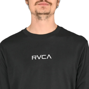
Breaking Down the RVCA Wordmark
Let’s start with the most recognizable piece: the RVCA wordmark.
At first glance, it looks simple — four letters, all caps, tightly spaced. But the details matter.
Why “RVCA” Looks the Way It Does
The letters are:
-
Geometric
-
Sharp but not aggressive
-
Symmetrical where possible
-
Clean enough to work on anything
There’s no flourish. No wave icon. No skateboard silhouette. Not even a lightning bolt. Nothing that would give it away directly as an extreme sports brand tied to any particular genre of sport. That’s intentional.
The design avoids tying the brand to any single subculture, which allows it to exist comfortably in multiple worlds.
Why the Letters Feel Abstract
RVCA’s typography almost feels non-linguistic. You read it, but you also kind of just recognize it as a shape.
That’s not an accident.
By making the wordmark visually abstract, RVCA allows it to:
-
Function globally (language-neutral)
-
Feel timeless rather than trend-based
-
Avoid dating itself to any specific era of action sports graphics
It’s less “logo” and more symbolic identifier. Like the notorious hidden arrow in the FedEx logo design, there’s more here than meets the eye.
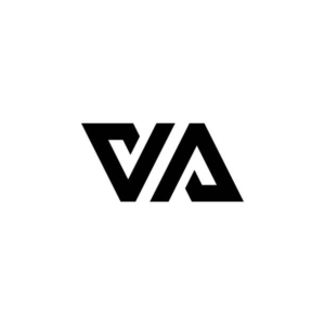 The VA Symbol: The Real Heart of RVCA’s Logo System
If the wordmark is the name, the VA symbol is the soul.
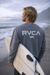
You’ve seen it on hats, tees, boardshorts, stickers, and walls. Two angular shapes facing each other, forming a mirrored, almost architectural mark. It’s as immediately eye-catching as it is simplistic with its symmetry making its mass appeal apparent. You can see why its used as often if not more than the full RCVA company logo.
What the VA Actually Stands For
Contrary to popular belief, the VA does not officially stand for something like:
-
“Visual Arts”
-
“Virginia”
-
“Victory Athletics”
The letters themselves are less important than what they represent.
The VA symbolizes:
-
Two opposing forces
-
Facing each other
-
Existing in equilibrium
It is a visual expression of The Balance of Opposites.
Why the VA Is Symmetrical
The symmetry is doing a lot of heavy lifting.![]()
Each side mirrors the other:
-
Neither side dominates
-
Neither side disappears
-
Both exist in equal tension
This reflects RVCA’s core belief that:
Progress happens when opposing ideas coexist, not when one erases the other.
That’s a bold concept to bake into a logo — and one reason it’s resonated for so long.
Why the Logo Feels “Architectural”
One of the most interesting things about RVCA’s logos is how structural they feel.
They don’t feel hand-drawn or organic. They feel:
-
Built
-
Engineered
-
Deliberate
That design choice reinforces the idea of balance and structure. It gives the logo:
-
Stability
-
Weight
-
Seriousness
Which is why RVCA can collaborate with:
-
MMA fighters
-
Fine artists
-
Professional surfers
-
Fashion designers
…without the logo feeling out of place in any of those environments. This gives the brand and company the versatility to move between multiple spaces and expands their ability to reach out past their core audience. Not a bad strategy.
Has the RVCA Logo Changed Over Time?
Short answer: very little — and that’s the point.
Subtle Refinements, Not Reinventions
Since its founding, RVCA has:
-
Kept the core VA symbol intact
-
Maintained the same overall wordmark structure
-
Avoided trendy redesigns
What has changed:
-
Line weight refinements
-
Spacing adjustments
-
Contextual treatments depending on collaboration or collection
But the core geometry remains.
Why RVCA Didn’t Rebrand Like Everyone Else
Many brands feel pressure to “modernize” every 5–10 years.
RVCA didn’t need to, because:
-
The logo was modern from day one
-
The design was intentionally timeless
-
The meaning was philosophical, not stylistic
When your logo is about balance, radically changing it would undermine the message. When it’s timeless, you don’t have to.
How RVCA Uses the Logo Across Different Worlds
One of the smartest things RVCA has done is adapt the logo without altering it.
In Action Sports
On surf and skate gear, the logo often appears:
-
Small
-
Centered
-
Functional
It’s there to identify, not dominate.
In Art Collaborations
With artists, the logo sometimes:
-
Takes a backseat
-
Is partially deconstructed
-
Appears alongside original artwork
This reinforces RVCA’s respect for creative expression.
In Fashion Collections
In fashion-forward releases, the logo can be:
-
Oversized
-
Repeated
-
Treated as a graphic pattern
Same mark. Different context. Same meaning. It is also frequently cut to an even more simplified ‘VA’ design for when the company’s logo is benefitted by being discrete or streamlined.
Why the Logo Works So Well (From a Design Perspective)
From a purely technical standpoint, the RVCA logo succeeds because it is:
-
Scalable – works at any size
-
Reproducible – prints cleanly on any material
-
Versatile – fits multiple industries
-
Memorable – distinct without being loud
From a brand standpoint, it works because it:
-
Doesn’t chase trends
-
Doesn’t explain itself too much
-
Rewards curiosity
People ask what it means — and that question keeps the brand alive.
Common Misconceptions About the RVCA Logo
Let’s clear up a few things.
“RVCA Is Just a Surf Brand”
Not really. Surfing is part of it, but not the whole story. While surfing will always be cornerstone of the RVCA brand, it’s pretty clear that they have ambitions that stretch far beyond the surfboard.
“The Logo Is Random”
It’s not. It’s deliberately abstract, which is very different.
“VA Stands for Something Literal”
It doesn’t need to. The meaning is conceptual, not acronym-based. While that may seem unnecessary and out there to some, it definitely fits the vibe of RCVA.
Why RVCA’s Logo Still Matters Today
In a world where logos are constantly:
-
Simplified
-
Rounded off
-
Softened to death
RVCA’s logo remains sharp, confident, and unchanged.
That consistency communicates:
-
Confidence in identity
-
Respect for original vision
-
Trust in the audience to “get it”
And that’s rare. From the iconic Nike swish to McDonald’s golden arches, logos can have a fundamental impact on a brand, it’s successes, and even, in rare cases, broader culture. That’s pretty dope.
Final Thoughts: Why the RVCA Logo Has Endured
RVCA didn’t design a logo to chase attention.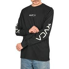
They designed one to hold meaning over time.
The VA symbol isn’t trying to tell you what to think. It’s inviting you to consider balance — between art and sport, expression and performance, chaos and structure.
That’s why the logo still works.
That’s why it hasn’t needed a dramatic overhaul.
And that’s why people still wear it 20+ years later.
When a brand knows who it is, the logo doesn’t need to shout.
It just needs to stand there — perfectly balanced — and let everything else orbit around it.